How We Controlled Color Difference in a Custom Ceramic Project
News 2026-09-02 55
Color is one of the most challenging parts of a Custom Ceramic project. A color that looks correct on a computer screen, printed drawing, or paper color card may appear very different after being applied to a ceramic body and fired at high temperature. Glaze thickness, raw materials, firing temperature, kiln atmosphere, porcelain body color, and even the position of a product inside the kiln can affect the final result.
In a recent Custom Ceramic project, the client required a coordinated ceramic collection with a specific color tone. The finished products needed to match the interior design concept and remain visually consistent across multiple production batches. To reduce color difference, we established a complete process covering color confirmation, sample testing, raw-material management, firing control, and final inspection.
This project demonstrated why color management must begin before mass production rather than after the products leave the kiln.
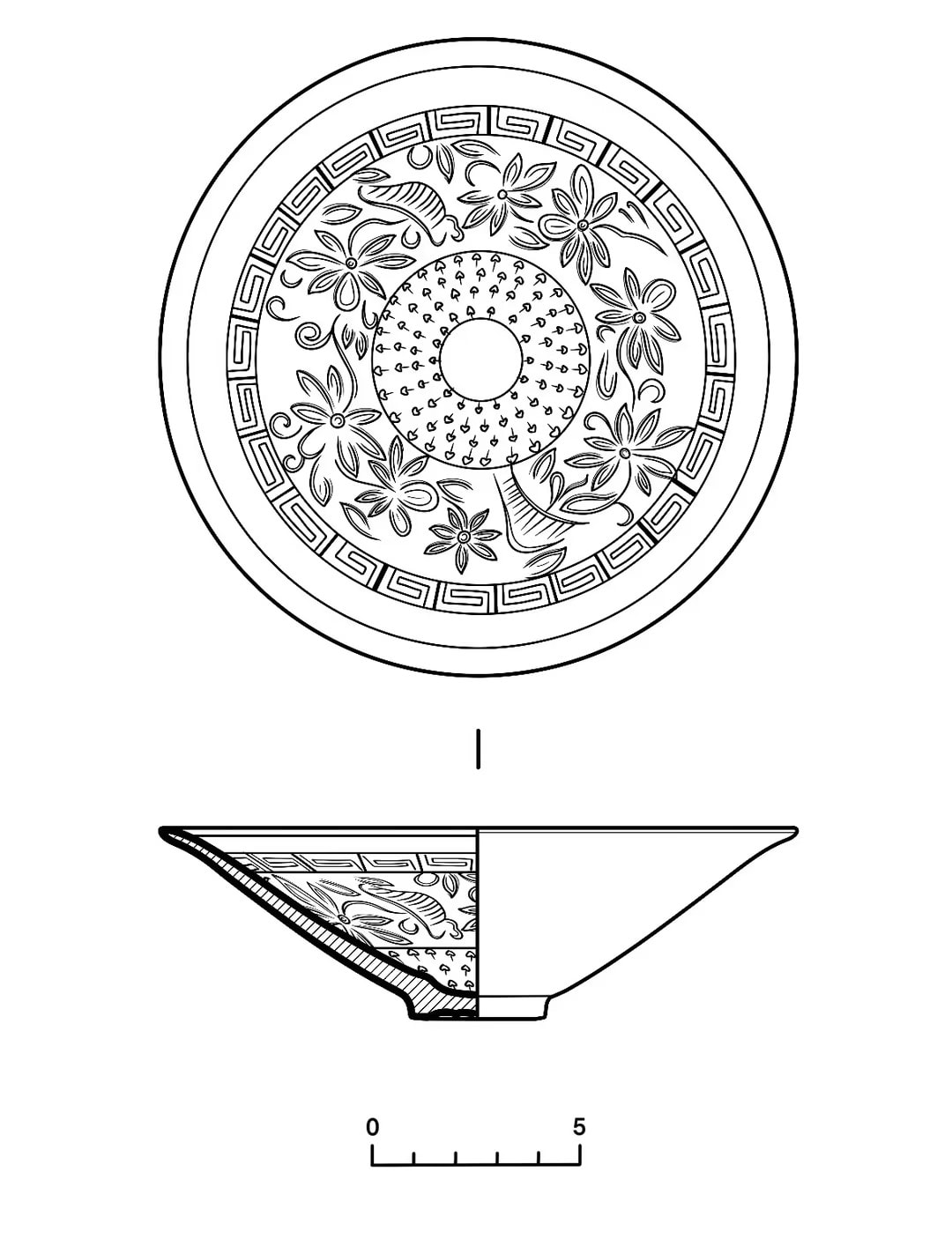
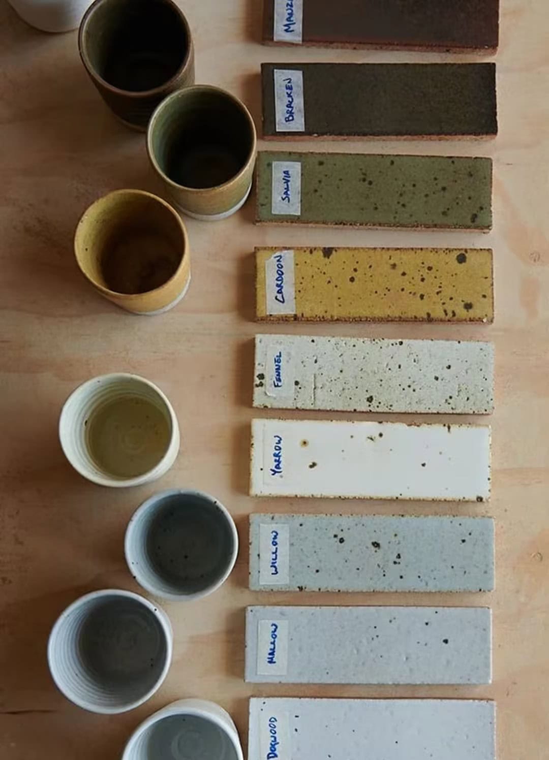
Why Color Difference Occurs in Custom Ceramic Production
Ceramic color is created through a chemical and physical reaction during firing. It is not the same as printing paint onto paper or applying color to plastic.
Several factors can influence the final color of a Custom Ceramic product:
- The mineral composition of the glaze
- The color and absorption rate of the porcelain body
- The thickness of the applied glaze
- The concentration of ceramic pigments
- The firing temperature and firing curve
- The oxidation or reduction atmosphere inside the kiln
- The location of each piece in the kiln
- The size, shape, and wall thickness of the product
- The surrounding light used during inspection
These variables are especially important for Jingdezhen ceramic tableware, decorative porcelain, ceramic murals, and other products that must coordinate with a specific architectural or hospitality color scheme.
A small ceramic cup and a large vase may use the same glaze formula but still show slightly different results. The glaze may accumulate more heavily around curved areas, carved patterns, corners, or the lower part of a vessel. Large ceramic panels may also respond differently to heat because of their size and surface area.
For this reason, color difference cannot always be completely eliminated. The practical objective is to establish a controlled and acceptable color range before production.
Step 1: Converting the Design Color into a Ceramic Standard
At the beginning of the project, the client provided digital renderings and a standard color reference. However, screen colors cannot be used as the only production standard because computer monitors display color through light, while ceramic surfaces reflect light through glaze.
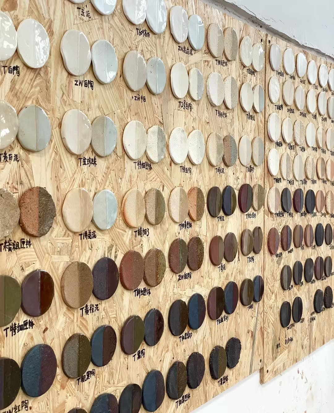
Our first task was to convert the requested color into a physical ceramic reference.
We reviewed the client’s design under different lighting conditions and discussed the intended application. A Custom Ceramic product installed under warm hotel lighting may appear different from the same product viewed under natural daylight or cool retail lighting.
Instead of approving the project according to a digital image alone, we prepared physical ceramic color samples. These samples allowed the client to evaluate the actual glaze surface, brightness, transparency, texture, and interaction with the porcelain body.
This step is important when working with professional Jingdezhen ceramic manufacturers. A Pantone number, RGB value, or printed sample can provide direction, but the final approval should be based on a fired ceramic sample whenever possible.
Step 2: Producing a Color Sample Matrix
Rather than testing only one formula, we created a group of samples with controlled variations. Each sample adjusted one or more factors, such as pigment concentration, glaze thickness, firing temperature, or surface finish.
The samples were marked with identification numbers so that every result could be traced back to its formula and firing conditions.
The sample matrix included:
- A lighter version of the target color
- A standard middle-range version
- A darker and more saturated version
- Different glaze thicknesses
- Glossy and matte surface options
- Samples fired at slightly different temperatures
This process helped us understand how sensitive the selected color was to production changes. It also gave the client several physical options instead of asking them to approve a single sample with no comparison.
After reviewing the fired samples, the client selected the preferred color standard. We then retained the approved sample as the master reference for the next stage of the Custom Ceramic project.
Step 3: Controlling the Porcelain Body and Glaze Materials
The same glaze can appear different when applied to different porcelain bodies. A bright white body may make a color look cleaner and more vivid, while a warmer or slightly gray body may reduce brightness or change the undertone.
To improve consistency, we used porcelain bodies from the same prepared batch for the main production run. We also checked moisture content, forming conditions, and the surface condition of the dried bodies before glazing.
Glaze materials were weighed and mixed according to recorded formulas. The glaze slurry was screened to remove impurities and kept at a controlled density. During production, the team regularly checked the glaze condition to reduce changes caused by settling, evaporation, or uneven mixing.
For Jingdezhen ceramic tableware, consistent glaze application is particularly important because plates, bowls, cups, and serving pieces may be placed together on one table. Even a moderate difference between products becomes more visible when multiple pieces are displayed side by side.
The same principle applies to decorative porcelain and ceramic murals. In a large ceramic mural, neighboring panels must create a continuous visual effect. If one panel is noticeably lighter, darker, warmer, or cooler, the difference may interrupt the complete image.
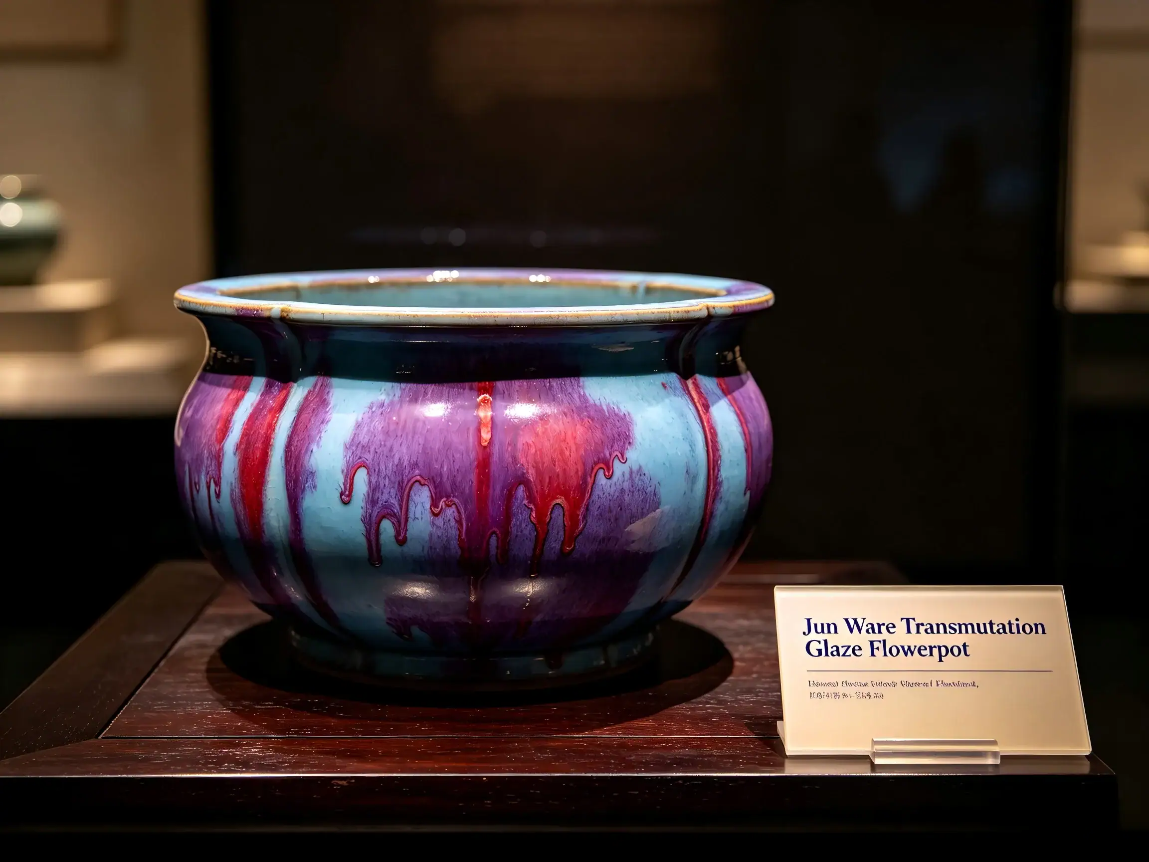
Step 4: Standardizing Glaze Thickness
Glaze thickness is one of the most common causes of color variation in a Custom Ceramic project.
If the glaze layer is too thin, the porcelain body may influence the appearance, making the color look lighter or less saturated. If the glaze is too thick, the color may become darker, more transparent, or uneven. Thick glaze may also accumulate around carved areas, rims, handles, or textured surfaces.
To control this factor, we standardized the glazing method and recorded the operating conditions. Depending on the product, glazing may involve dipping, spraying, pouring, brushing, or a combination of methods.
The production team checked:
- Glaze density
- Application time
- Spray pressure and distance
- Number of glaze layers
- Drying time before firing
- Glaze accumulation around edges and recessed areas
Trial pieces were weighed or visually checked before firing to confirm that the glaze application remained within the approved range.
This level of control is essential for customized shapes. A complex vase, relief decoration, irregular plate, or sculptural object cannot always be glazed in exactly the same way as a standard round bowl.
Step 5: Controlling the Firing Process
Even when raw materials and glaze thickness are consistent, the kiln can still create color differences.
Temperature does not remain perfectly identical in every part of a kiln. Products placed near the kiln door, heating elements, burners, shelves, or airflow channels may experience slightly different firing conditions.
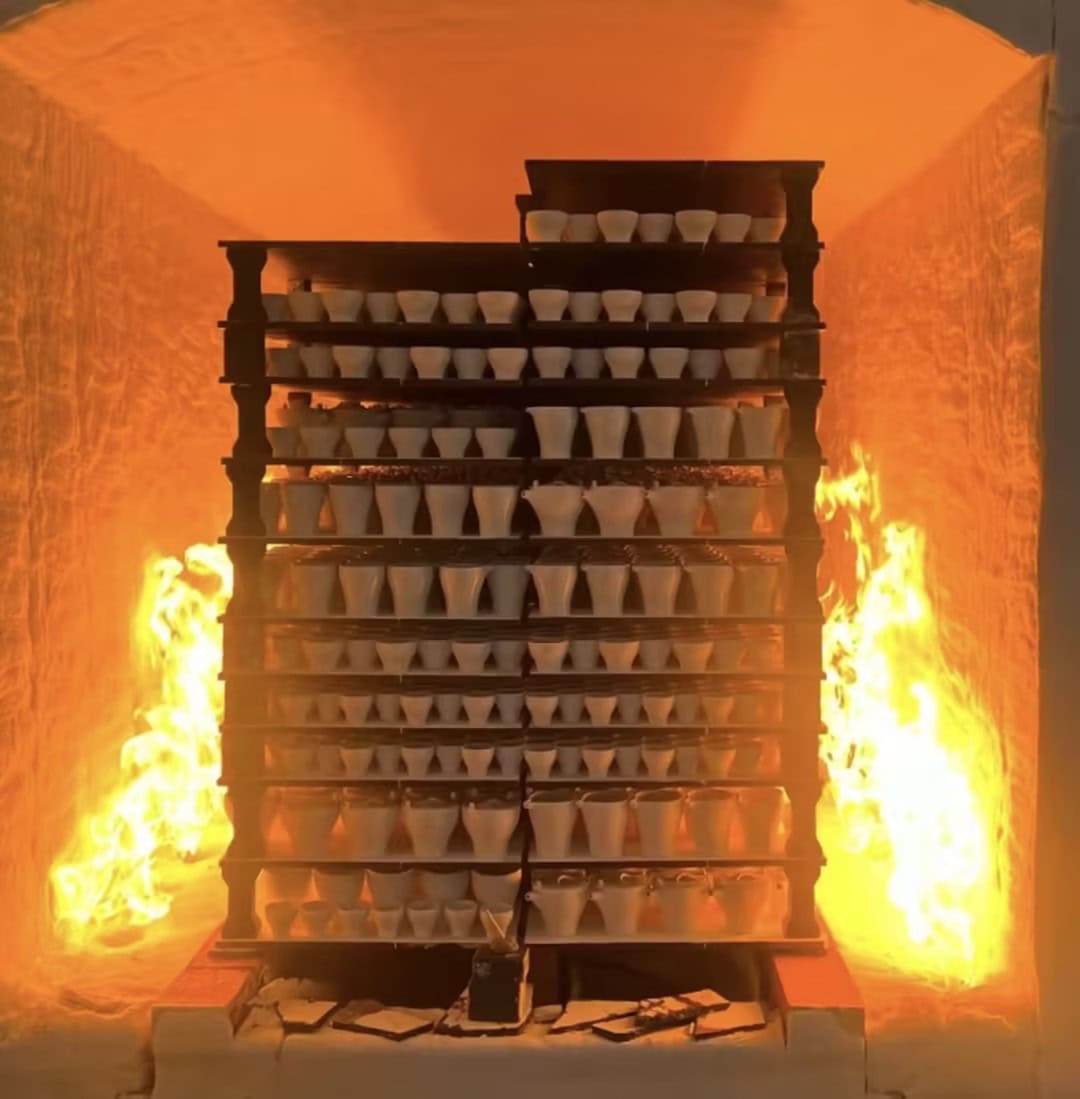
Before mass production, we recorded the firing results of the approved samples and established a target firing curve. During production, we controlled the heating rate, peak temperature, holding time, and cooling process.
We also considered product placement. Pieces requiring close color consistency were arranged in planned kiln zones rather than being placed randomly. Test cones and kiln records helped the team evaluate heat distribution.
For large Custom Ceramic products, decorative porcelain, and ceramic murals, kiln positioning becomes even more important. Larger pieces heat and cool differently from small tableware and may require a separate firing plan.
Step 6: Creating an Acceptable Color Range
Traditional ceramic production cannot be evaluated in exactly the same way as industrial plastic or printed metal products. A reasonable tolerance must account for the natural characteristics of ceramic materials and high-temperature firing.
Instead of using only one perfect sample, we created an approved color range. This included:
- A master color sample
- The lightest acceptable sample
- The darkest acceptable sample
- Approved surface and gloss variations
After firing, products were inspected against these references. Pieces that fell within the approved range were accepted. Products with obvious differences were separated for review.
This method gave the quality-control team a practical and repeatable standard. It also allowed the client to understand which variations were normal and which would be considered unacceptable.
Professional Jingdezhen ceramic manufacturers should communicate this range clearly before production. Describing every handmade or firing-related difference as a defect is unrealistic, but accepting uncontrolled variation is also inappropriate. The correct approach is to define the limits together.
Step 7: Sorting and Matching the Finished Products
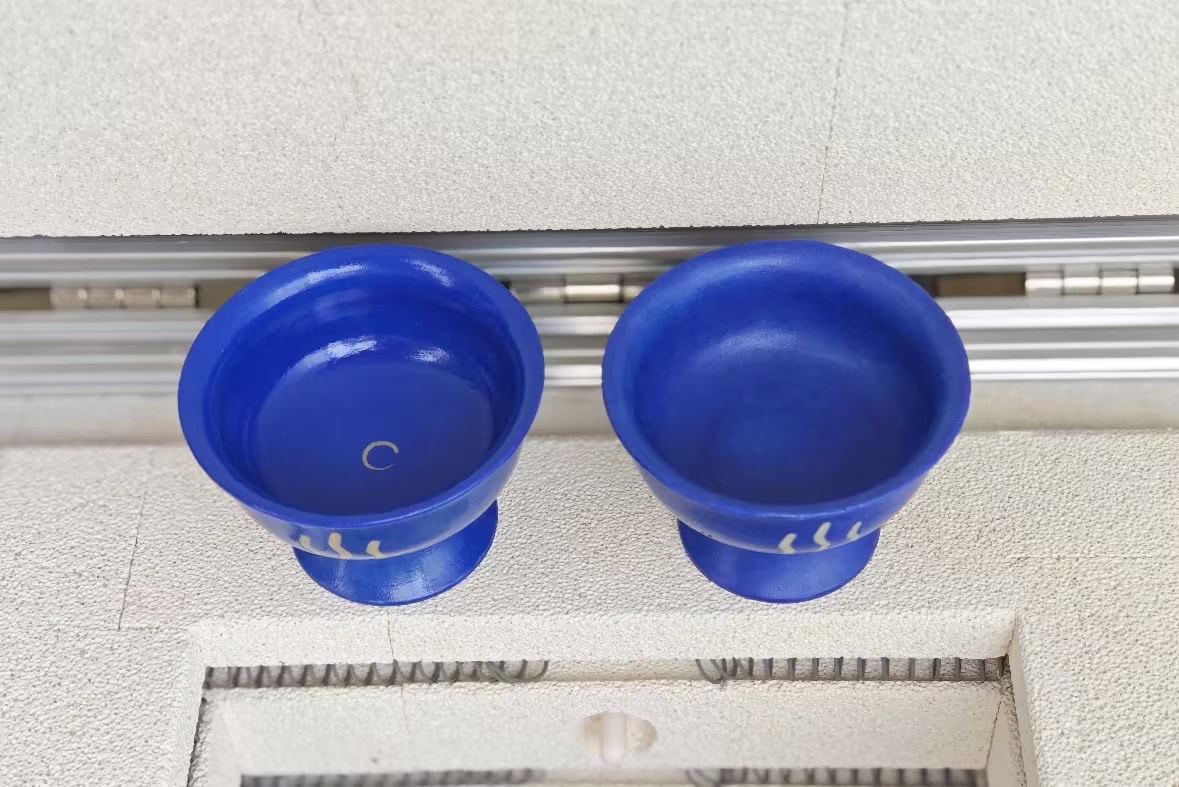
After firing, the products were inspected under consistent lighting. We checked color tone, saturation, glaze coverage, gloss, texture, and visible defects.
The finished pieces were then sorted into visually coordinated groups. Products intended to be used together were matched as closely as possible.
For example, complete sets of Jingdezhen ceramic tableware should not contain noticeably different shades within the same carton. Ceramic mural panels should be arranged according to their installation positions before packing. Decorative porcelain displayed as a collection should also maintain a coordinated appearance.
We recorded the inspection results and separated pieces that did not meet the approved standard. This final sorting step helped prevent obvious color differences from reaching the client’s project site.
What We Learned from the Project
The most important lesson was that color control is a complete production system, not a single inspection task.
Successful Custom Ceramic color management requires:
- A clear design reference
- Fired physical samples
- A documented glaze formula
- Stable porcelain and glaze materials
- Standardized glaze application
- Controlled kiln firing
- An approved color tolerance range
- Final sorting under consistent lighting
It is also important for clients to allow enough time for testing and adjustment. Requesting immediate mass production before confirming fired samples increases the risk of disagreement later.
Color should also be evaluated in the actual application environment whenever possible. A sample viewed in a factory under white inspection lights may appear warmer inside a hotel, darker in a restaurant, or more reflective under exhibition lighting.
Conclusion: Managing Color Difference in Custom Ceramic Production
Color difference is one of the unavoidable technical challenges of Custom Ceramic production, but it can be reduced through careful planning, testing, documentation, and quality control.
From Jingdezhen ceramic tableware and decorative porcelain to large ceramic murals, every product category requires a color-control method suited to its materials, size, surface, and final use. The goal is not to promise that every ceramic piece will be microscopically identical. The goal is to define an approved visual standard and keep the finished production within that range.
Based in Jingdezhen, China, Magic Cube (MC Ceramic) works with designers, hotel buyers, architects, distributors, and project purchasers to develop customized ceramic products. Through physical sampling, glaze testing, firing control, production records, and final color matching, Magic Cube helps clients turn design concepts into finished Custom Ceramic products with reliable and visually coordinated results.